
 Share This
Highmark’s health plan members have long enjoyed the convenience of having an online search tool to help them find doctors, medical facilities and other medical providers. In 2017, Highmark officially launched a brand new provider search tool — built from the ground up by its own internal experts and based heavily on the feedback and needs of its customers.
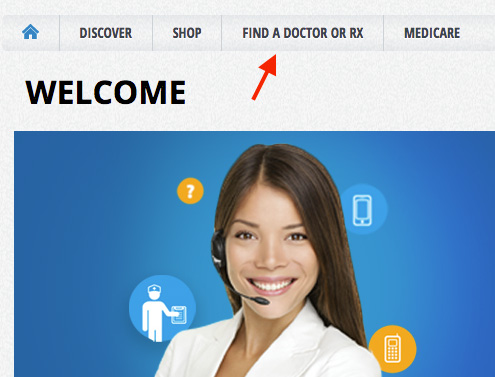
If you haven’t tried it out yet, go to the member website listed on the back of your member ID card, then click “Find a Doctor or Rx” at the top of the page to see just how easy the new tool is to use.
Hugh Dunn, now a manager of digital strategy at Highmark Health, was one of the key user experience designers on the internal team that brought the new tool into existence. “My role was to take the business requirements we had for the project and turn that into the best experience possible for the end user,” he says. “We wanted the new provider search tool to provide the simplest, quickest, most streamlined way for our members to get the information they need.”
According to Dunn, Highmark had two main reasons for building a new tool. First, bringing the tool fully under the company’s control and integrating it with the member website, instead of relying on an outside contractor, would save Highmark and its members nearly half a million dollars annually.
However, the most important reason was to improve the customer’s experience — to build a better tool by making it easier to figure out, faster, and more valuable in delivering what members most wanted from a provider search feature. In addition to immediately noticeable changes that make the new tool work “more like Google”, Dunn says there were design changes you might not think about consciously that also help improve your overall experience.
“By bringing the tool in-house, we were able to make it more consistent with experiences on our other websites,” he points out. “As a member, you start to recognize the colors and fonts and basic elements associated with all of the sites, and that makes everything, including something like a provider search tool, easier to understand and use.” He adds that the tool was also designed, like Highmark’s member website, to achieve 508 compliance — which means the site is accessible for people who have low visibility or no vision or have other needs when it comes to using the Internet. (See sidebar for more on 508 compliance.)
So, once you commit to building a better provider search tool — where do you start? Dunn says that before any design work began, the team devoted time and effort to understanding what users wanted from a provider search tool.
“We started off with market research where we asked almost 2,500 different consumers, ‘What are the most important things to you when you’re trying to find a new doctor?’” Dunn explains.
From that research, the team derived a wide-ranging list of what users wanted and then ranked how important each “want” was based on all feedback. “For example, on our final list, one of the most important features was being able to know whether a provider is in-network,” says Dunn. “And one of the least important factors was knowing whether a provider does prescription refills online.”
Ideas about how the new tool should be designed and what it should do were also shaped by online survey feedback on what people liked and didn’t like about Highmark’s previous search tool. “One focus of feedback on the old tool was that it took a long time to actually get to a list of providers,” says Dunn. “You had to fill out lots of pieces of information before any providers come up. You had to manually type in your location. You had to pick your plan. You had to pick what type of service provider you were looking for. If you wanted a specialty, you had to select a specialty. We knew that there were cases where doing all that was a barrier for people, so addressing that was a priority in building the new tool.”
Based on all the initial research data, the design team went to work creating a series of working prototypes. The goal was to cover several different possibilities — then have hands-on testing show what worked and didn’t work for each of the designs.
“We had our baseline model, which was that you had to enter all this information first, and then you would get your search results,” Dunn says. “On the other end of the spectrum, we had a totally “Google” version, where you just have one open search bar, and you type in whatever you want and we bring up results for you. And then we had a couple variations in between. So essentially we did a side-by-side comparison of different design prototypes to see what allowed people to do things best from a search standpoint.”
Testers went through the same set of tasks with each of the designs, while the design team recorded how long it took the user to complete the task as well as how many mistakes they made along the way. They also collected qualitative data — inviting users to describe how it felt to use the search tool and whether they enjoyed the experience. Below is a small sample of the user testing videos, including brief “title notes” the user design team added to help categorize feedback in specific video segments.
[User 1 speaking]
Select that and go ahead and hit refine. So now I have Wanda, Jeanette, Francis, Anna, Ann, Mary – that worked great. I was able to refine the results on the righthand side, and that was easy to do. So I’ll go back now to the test and hit next. Yes, I’m sure I completed the entire task successfully.
Overall this task was very easy. The refined results really stood out to me, because of the white text on the black background.
[User 2 speaking]
Oh, here it is, sort by distance. I didn’t expect to see a drop-down. What other way can this be. A to Z. Z to A. So there’s three different ways. I’ll keep it as distance, which is sort of what I’m accustomed to. Oh wow. You can refine these by hospital, whether it’s handicapped accessible, by their awards, their affiliation with whatever hospital, family practice, general practice, gynecology, internal medicine, so you can really refine this search a lot.
[User 3 speaking]
Make sure your search results show only female PCPs near you. Alright, I saw that option to search, to refine by women. Ok, so but then how do I — so there’s eight of them. But there’s nothing that says enter. So did I just do it? Is this all women? Ok, it did. I somehow thought that — it didn’t give me the heads up that it searched.
[User 4 speaking]
Looks like I have three — I have six provider results. And I want to see if I can refine this again to select a female. Ok, I can. Now how do I get back out. Ok, it automatically did it, but this window doesn’t close itself.
[User 5 speaking]
This is just not working for me, guys. I don’t know what it is you expect me to do, but I don’t see anyplace to put in a zip code. I’m going to try this, umm, and see if it works there. And see if that helps. And see what that does. But what I got — it doesn’t — all it is, is the same people again, in a different order, but it doesn’t tell me, you know, whether or not they’re the zip code I want or…I don’t know what you expect me to do here, so I’m…
A similar testing process was applied to gauging different ways that search results were displayed. “So, for example, when search results are displayed, do people want them on a map — how visual do they want the results to be, as opposed to just seeing primarily text?” Dunn says.
In general, Dunn says that testing showed that users preferred a simplified system. “What came out naturally in the testing was that, for the most part, the best tool would have a lot in common with the Google model,” Dunn says. “Everybody is used to how Google works. It’s very quick. It’s very efficient. When people see a search box, there is now generally an expectation that it will perform a specific way. So as we were finalizing decisions about how to design the tool, we focused on meeting that expectation and giving people the model that would be immediately familiar and allow them to perform their searches quickly and easily.”
He adds that the research was interesting on another level. “I realized that we weren’t giving users enough credit,” he says. “That original tool was really holding your hand step by step through finding a doctor. But in reality, users are much more savvy than that. They’re used to these higher-end online tools and they just want to type in a search box, get the search results, and take it from there.”
The search results for a doctor or medical facility present another challenge: There is potentially a lot of information to share, which may be important for some people, but feel like unnecessary clutter to others. So — how much information should a provider search tool give to a user?
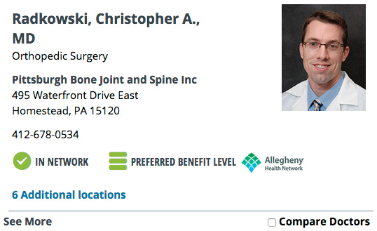
Highmark’s design team decided to follow what Dunn calls a “bite-snack-meal” model. “This is a philosophy we use for other web content as well, especially in any situation where you have lots of pieces of information to deal with,” he explains. “So first, instead of hitting someone with all the information at once, we give a summary — a ‘bite.’ If you look at the provider search tool, when you get that first set of results, you see all the providers that match your search.” If you are just trying to find a phone number or contact information, he explains, that “bite” may be all you need.
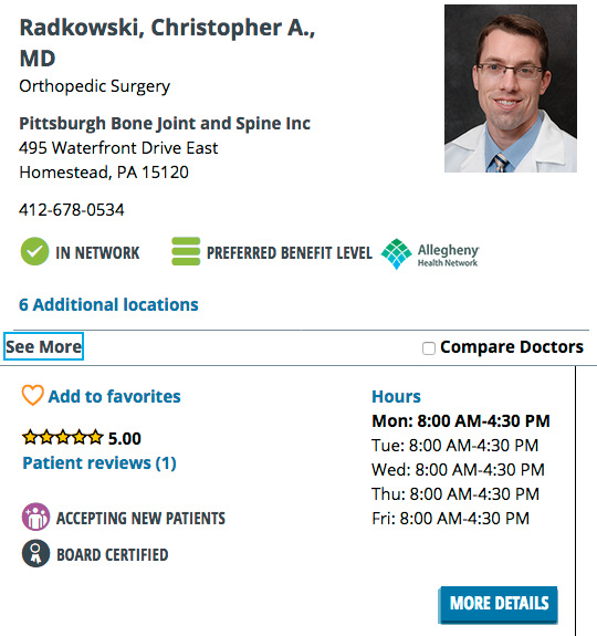
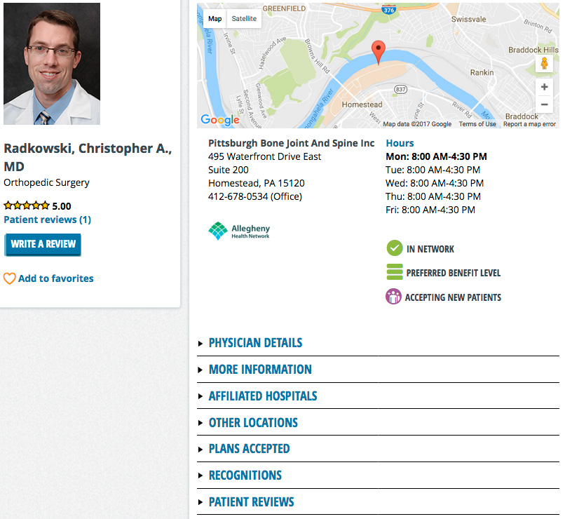
“If you click on any of those initial results in your list, a little ‘drawer’ opens with more information, including things like office hours, ratings, and whether or not they’re accepting new patients — that’s the ‘snack,’” Dunn continues. “If that’s not enough, there’s a button in the drawer that says ‘More Details’ and that will give you the full ‘meal’ — a detail page with every piece of information we have about the provider.”
From the start, Highmark’s new provider search tool was also designed to make it easy to keep improving it. As Dunn points out, even thorough research and testing such as that done for this project can’t anticipate everything — and the health care industry is experiencing a period of change, so today’s “perfect tool” may be missing something in the future.
With that in mind, the digital strategy team at Highmark is constantly collecting feedback on the provider search tool and then turning that feedback into additional improvements in how the tool looks, feels, and functions. According to Dunn, one area of improvement being worked on is to add more filters, while simultaneously speeding up how the filters are applied. Just as at the very beginning of creating the new provider search tool, such improvements, and future improvements, start with listening to what customers want.


Highmark Health and its subsidiaries and affiliates comprise a national blended health organization that employs more than 42,000 people and serves millions of Americans across the country.
Entire contents © Highmark Health. All Rights Reserved.
Highmark Health is an independent licensee of the Blue Cross Blue Shield Association.

 Need to find info about providers, prescriptions, coverage, claims, ID cards, or health spending or savings accounts? If so, your Highmark member site is the place to go. (It’s separate from this blog.)